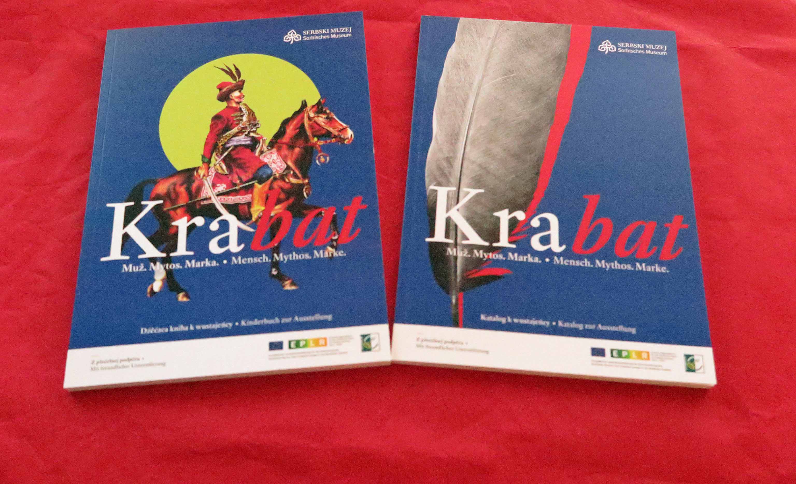
The font of the Krabat-exhibition
Sometimes bypath of an exhibition are quite interesting. Some of our visitors might have noticed the elegant and pleasant typeface, which is used in the exhibition and for the exhibition catalogue. Some people tend to oversee that kind of aspect.
But, can you believe that the font derives from the time of Johann von Schadowitz!
The author and carver of the types was the Hungarian Miklós Kis, who was born in 1650 in Misztótfalu, nowadays in Romania. At this time Johann von Schadowitz was 26 years old.
Originaly a teacher, Kis went to Amsterdam to study theology and only came in touch with printing through the task to oversee the printing of an hungarian Bible.
The font he invented is part of the Antiqua-fonts with rounded sigantures, which are oriented on antique examples, in difference to the „Blackletters“ like the Schwabacher and the Fraktur.
This Antiqua-font is suitable for the use of diacritics, that you find often in hungarian and slavonian texts. Kis worked in Klausenburg, hungarian Kolozsvár, today Cluj-Napoca in Romania) after his return from the Netherlands until he dies in 1702. Until recent times this font, and customized derivates of it was known under the name Janson. (For further information see: http://www.typografie.info/3/artikel.htm/wissen/janson-antiqua-kis).
This means, when you visit our the special exhibition or have a fine read in the exhibitions catalogue, not only the content but also the font will bring you back to the time of the historical Krabat.
We thank the design-agency logoform for recommending this font.